
There are valid use-cases for which the UI must react to an occurring overflow (beyond just showing a scrollbar).
Currently those cases always require a javascript solution.
The required code to deal with such use-cases could be simplified if the fact that an overflow occurred was accessible in the CSS.
A new CSS pseudo class :overflow-<side> would satisfy this need.
Proposed Mechanism
The following CSS pseudo class selectors are added to the standard:
-
:overflow-topA selector that matches any HTML element which has content overflowing its top boundary. For this the element must be a scroll container i.e. the content must exceed the available size and the computed style for
overflowin this direction must bevisible,hidden,scroll, orauto; it must not beclip. -
:overflow-rightanalogous to
:overflow-topbut concerned with the right boundary -
:overflow-bottomanalogous to
:overflow-topbut concerned with the bottom boundary -
:overflow-leftanalogous to
:overflow-topbut concerned with the left boundary
Further shorthand selectors could be added:
-
:overflow-xmatches an element if it matches at least one of:overflow-leftor:overflow-right -
:overflow-ymatches an element if it matches at least one of:overflow-topor:overflow-bottom
use-case Examples
indicate content scrolled out-of-sight due to overflow
For text content for which it is important that the user is aware of potentially concealed parts of the text due to overflow we can show a shadow overlaying the content towards the edge where the overflow occurs.
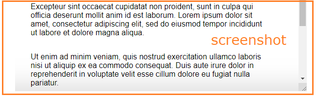
A pure CSS solution using the proposed pseudo class would work with the following CSS:
.scroll-container {
  /* inset | offset-x | offset-y | blur-radius | spread-radius | color */
  --top-shadow: inset 0 80px 48px -64px #00000021;
  --bottom-shadow: inset 0 -80px 48px -64px #00000021;
}

.scroll-container:overflow-top {
  box-shadow: var(--top-shadow);
}

.scroll-container:overflow-bottom {
  box-shadow: var(--bottom-shadow);
}

.scroll-container:overflow-top:overflow-bottom {
  box-shadow: var(--top-shadow), var(--bottom-shadow);
}
show custom controls to enable scrolling when a scrollbar is undesired
When the design omits the default scrollbar but offers custom buttons to scroll the content we want to a) display the buttons only when there is actually an overflow and b) enable a button to receive clicks only when there is scrollable area in the respective direction.
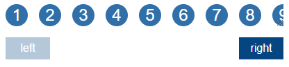
A pure CSS solution using the proposed pseudo class would work with the following CSS:
/* .scroll-left disabled */
.scroll-container:not(:overflow-left) + .scroll-buttons .scroll-left {
  cursor: default;
  pointer-events: none;
  opacity: 0.3;
}

/* .scroll-right disabled */
.scroll-container:not(:overflow-right) + .scroll-buttons .scroll-right {
  cursor: default;
  pointer-events: none;
  opacity: 0.3;
}
Roadblocks
The proposed feature does not fit well into how browsers currently render a document.
Selectors are matched, resulting in styles being applied, resulting in layout, causing overflow, which would now need to trigger matching of :overflow selectors and applying corresponding styles, which could cause more overflow or undo an overflow; potentially causing an infinite cycle.
The same concern has been discussed here without a feasible solution.
Alternatives
Some use-cases could be solved with a pure CSS solution, using other proposed CSS features:
As of writing this proposal scroll-linked-animations are still an experimental feature.
However, it has progressed quite far; it seems the spec for version 1 is nearing a stable state.
At the moment a polyfill is available.
An alternative implementation of the first use-case using scroll-linked-animations would look like this:
@keyframes adjust-shadow {
  0% {
    box-shadow: var(--hidden-top-shadow), var(--visible-bottom-shadow);
  }
  1%,
  99% {
    box-shadow: var(--visible-top-shadow), var(--visible-bottom-shadow);
  }
  100% {
    box-shadow: var(--visible-top-shadow), var(--hidden-bottom-shadow);
  }
}

.scroll-container.with-shadow {
  --visible-top-shadow: inset 0 80px 48px -64px #00000021;
  --visible-bottom-shadow: inset 0 -80px 48px -64px #00000021;
  --hidden-top-shadow: inset 0 80px 48px -64px #00000000;
  --hidden-bottom-shadow: inset 0 -80px 48px -64px #00000000;
  animation: 1s linear both adjust-shadow;
  animation-timeline: scroll();
}
Potential polyfill to allow experimentation
An implementation of a polyfill could be attempted to allow experimentation and exploration of the proposed feature, verifying whether it simplyfies dealing with overflow.