A partial archive of discourse.wicg.io as of Saturday February 24, 2024.

Color overlay filter proposal

nicolasjengler
2018-01-02

Lately I’ve been needing a filter similar to Photoshop’s own layer styles/blending options. My question is if something like this is achievable with the current state of most browsers’ rendering engines.

The following images are an example of how Photoshop handles this:

Without color overlay:

With color overlay:

As far as I understand, CSS blending modes aren’t able to achieve this sort of behavior, and syntax-wise I’m thinking that something like filter: color-overlay(#ff0000) should be enough.

This is just a pretty lighweight proposal but if there’s enough attention to this post, and seems achievable, I’ll try and write a full spec for it.

goatandsheep
2018-01-03

So it takes an image and changes the RGB value of the non-transparent pixels to match the given input?

nicolasjengler
2018-01-04

Yes, basically, but my idea is to use it for other elements as well, not only images.

Tigt
2018-01-09

It should be possible to do this today using a custom defined SVG filter, referenced from CSS.

<svg …>
  <filter id="color-overlay">
    <feFlood flood-color="red"/>
    <feBlend in2="SourceAlpha"/>
  </filter>
</svg>
element {
  filter: url(#color-overlay);
}

If you want to propose this as a CSS filter shorthand, the first step would be defining it via SVG <filter>, like the currently-implemented ones.

vincentriemer
2018-01-12

I’m not that familiar with svg filters so I tried this one out verbatim and it didn’t seem to work on a image element with transparency. I haven’t been able to find a working alternative either.

Tigt
2018-01-12

Ah, fair enough. Here’s a working CodePen (except Safari, can’t figure out why right now): https://codepen.io/tigt/pen/d820feb6082472382ec0778063e9ac08?editors=1100

If you wanted to define the filter solely in CSS, you could use a data: URI created with a preprocessor. Here’s a (naïve*) example for Sass:

@function color-overlay($color) {
  @return 'url("' + 
    "data:image/svg+xml,%3Csvg xmlns='http://www.w3.org/2000/svg'%3E\
%3Cfilter id='f'%3E\
%3CfeFlood flood-color='#{$color}'/%3E\
%3CfeComposite in2='SourceAlpha' operator='atop'/%3E\
%3C/filter%3E\
%3C/svg%3E#f" + '")';
}

(Escaped \ line breaks added for readability on Discourse. Browsers won’t tolerate them.)

If you need Safari support today, chaining the filter shorthands might work — something like filter: sepia(100%) hue-rotate({some amount});.

* You would need to URL-encode the $color argument.

vincentriemer
2018-01-13

Awesome, thank you that works great!

I do also think that this sort of effect deserves to get its own filter shorthand (iOS for example has a first class image property called tintColor that produces the same effect).

callumgare
2019-01-28

As a web dev this would be so handy. In fact it’s about every 6 months or so that I think surely this must be possible and try to google it only to be bummed to find out it’s still not. Right now I’m working the responsive version of a site menu which shows up as an overlay when the view port is under a certain size.

The icons need to be a different colour to show up on the different background. The site colours are stored in css variables so that they can be changed and previewed in real time when editing with the wordpress customizer editor (this design is a wordpress theme). I want to be able to set a colour overlay for an image to the value of a particular css variable. The embedded svg filter via preprocessed data string is very clever but loses the ability to use useful css functions like variables. A colour overlay css filter defiantly seems like super useful and quite generic so that it could be used in all sorts of different ways.

alinnert
2022-11-11

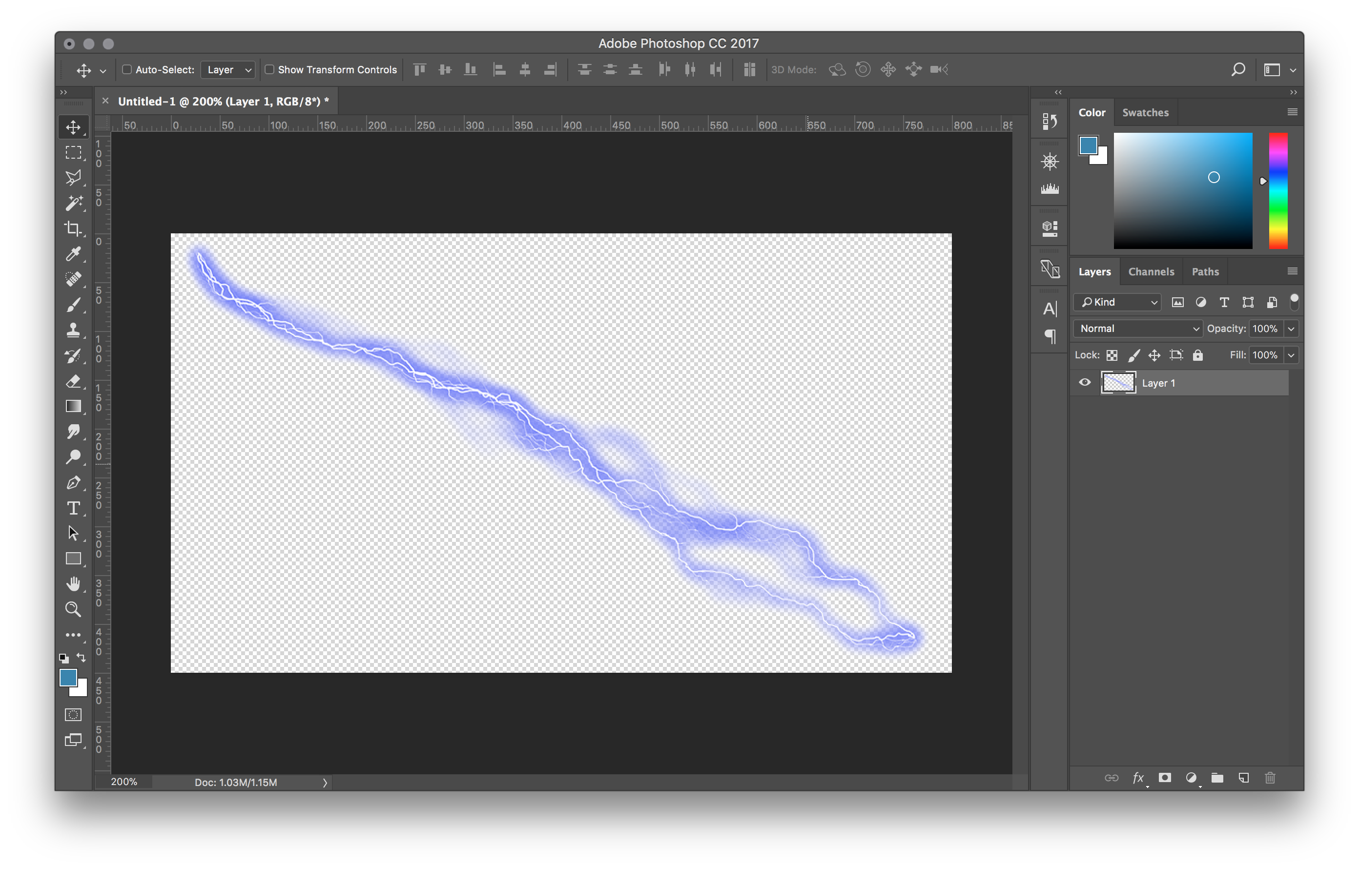
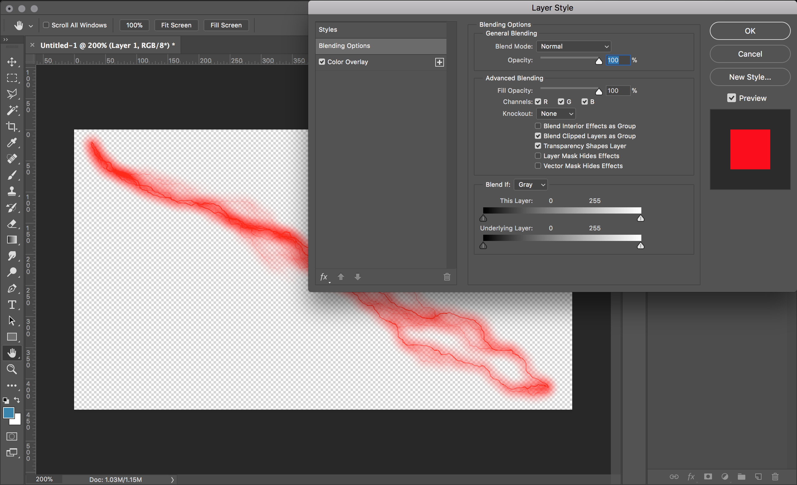
I would have needed this today. I wanted to tint a background image to be blue, so white text on top of the image is readable.

The current workaround is to make the image sepia first and apply hue rotation to make it (a very faint) blue. But that’s very unprecise because I’d need to know the hue value of the applied sepia color. Also, a saturate(9) was needed to make the blue as vibrant as in the mockup. The endresult looks like this:

filter: contrast(0.2) sepia(1) hue-rotate(190deg) brightness(0.45) saturate(9);

IMO there should be a tint() function that works similar to sepia() with an absolute hue or color value as an additional parameter. Like:

filter: tint(blue, 0.7);

The second parameter is the “strength” of the effect, similar to how it works in sepia(0.7). That could become pretty handy.

I’ve tested the behavior of the tint feature in Affinity Designer. It has the following behavior. I don’t know if there’s a standard behavior but I’d agree if CSS worked the same way:

  • Hue, saturation and brightness of the color passed to tint(color, strength) should affect the result
  • tint(white, 1) and every color with a brightness of 100% would result in a completely white image
  • tint(black, 1) and every color with a brightness of 0% would result in a completely black image
  • tint(gray, 1) would remove all colors, similar to grayscale(1)
  • I don’t know what exactly sepia(1) does but something similar should be achievable with tint(hsl(45, 40%, 50%), 1)

But what should happen with colors that include a non-1 alpha channel? Should it be ignored? I don’t think it’s a good idea to use the alpha channel as the filter strength to drop the need for a second argument. But I might be wrong.

IMO tint() really should be a thing. What do you think?